
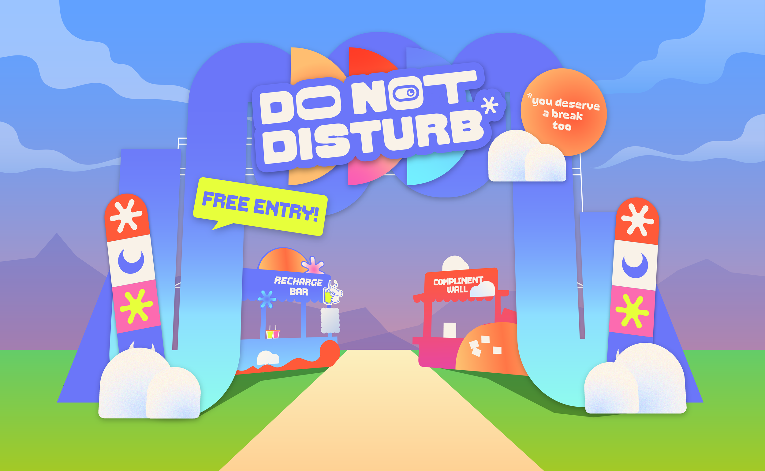
WHAT IS DO NOT DISTURB?

Do Not Disturb is an interactive pop-up experience built for one thing: giving you permission to stop. Not to fix your burnout, not to lecture you about self-care, but just a few hours, shared with other equally tired people, where doing nothing is actually the point.
You'll check in, you'll get stamped, you'll sit down with a drink that calms you down instead of trying to wake you up. Along the way you'll find out you're not the only one running on empty and share the experience with others like yourself.
21.10.2026

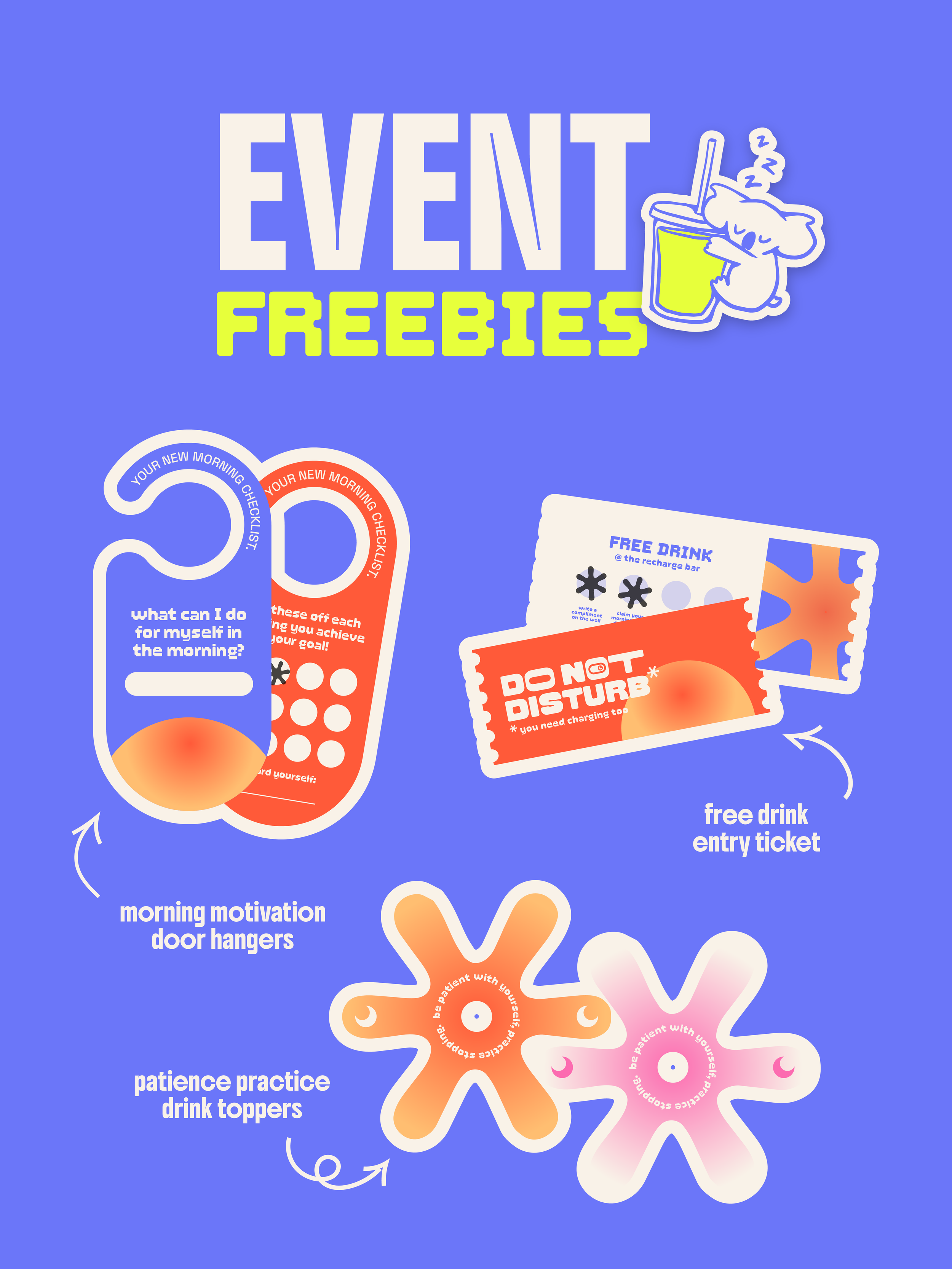
PICK UP THE FREEBIES!
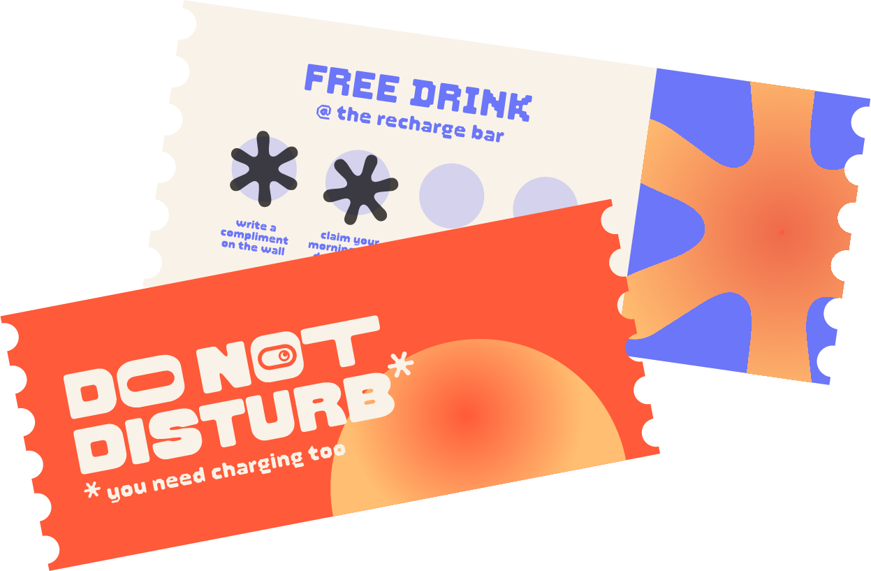
ENTRY TICKETS (REDEEM A FREE DRINK)
Your ticket in and your first drink on us. Hand it over at the Recharge Bar after you’ve gotten everything stamped and pick whichever drink you need.
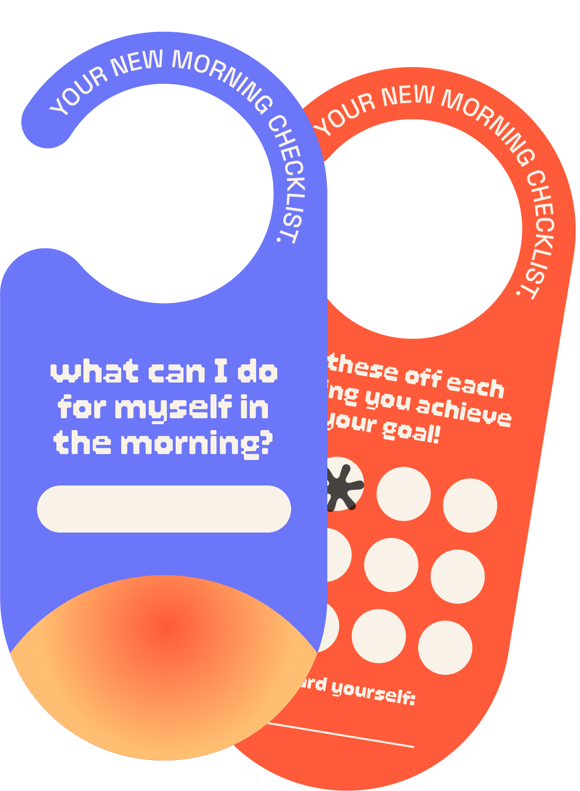
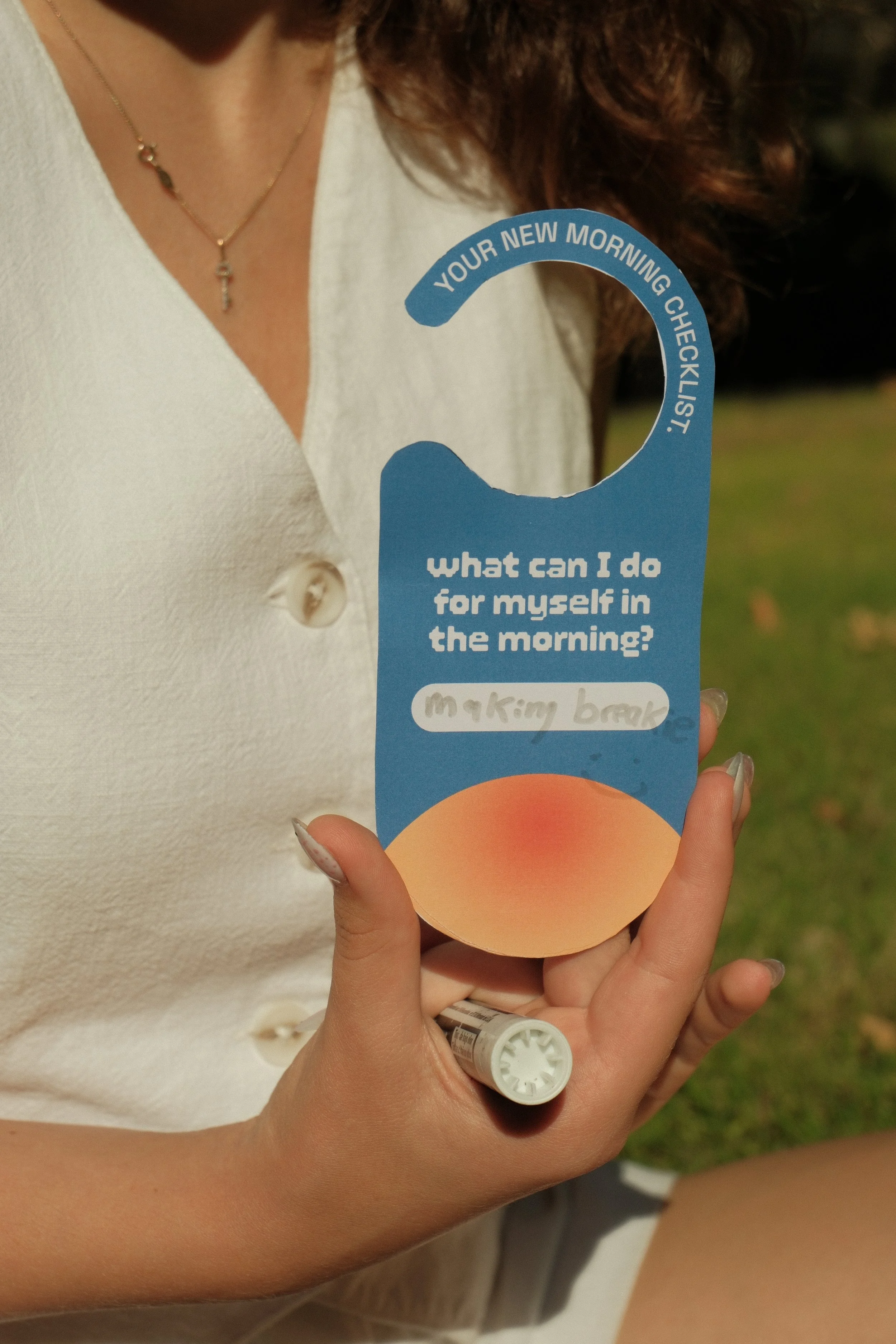
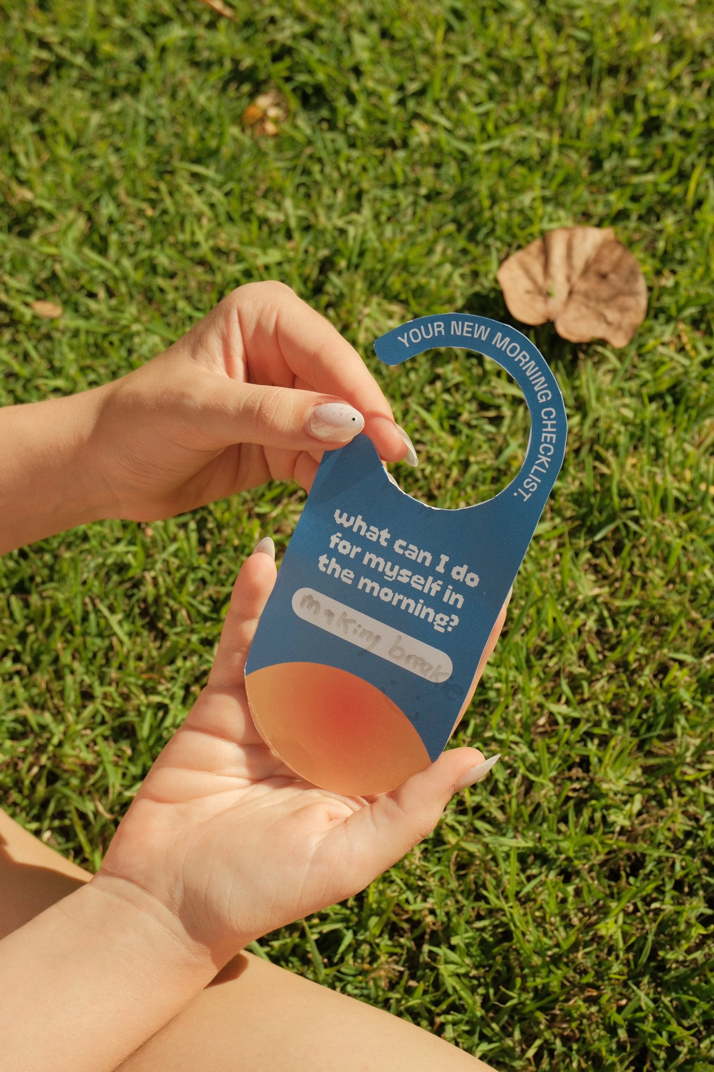
A Do Not Disturb sign for your own door, with a tiny checklist on the back for mornings that need a gentler start. Tick what you can, skip what you can't.
MORNING MOTIVATION DOOR HANGERS
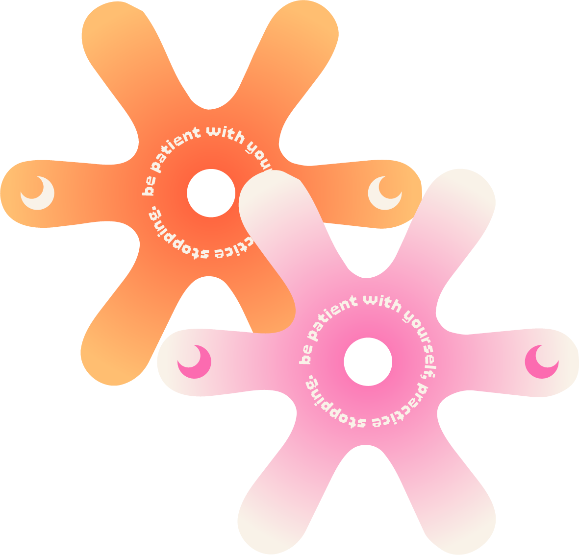
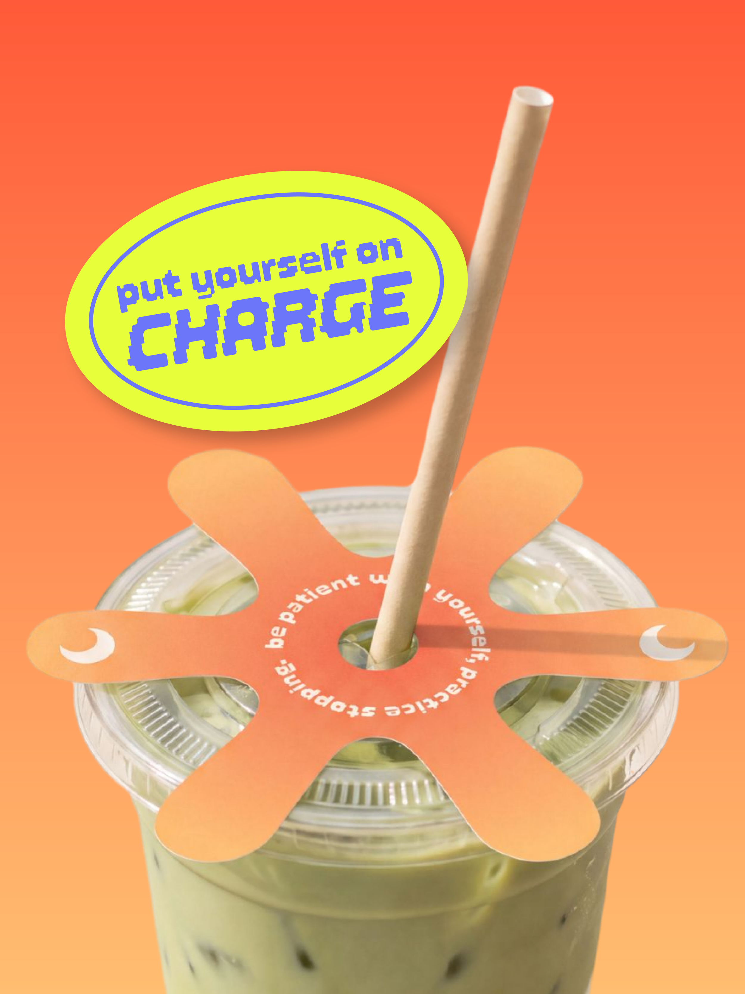
PATIENCE PRACTICE DRINK TOPPERS
A little reminder that slips over your cup and sits under your straw. Be patient with yourself, one sip at a time.
WHERE IS THE POP-UP?
BROADWATER PARKLANDS, SOUTHPORT, QLD
FOLLOW US FOR UPDATES
FAQs
Who is the pop-up for?
1
Anyone running on empty. We've designed it with students and young professionals in mind, but if you're someone who needs a break to step away from burnout, you're welcome!
Is it really free?
2
Yes. Entry is free, and so is your first drink when you grab your entry ticket and complete all of the stamps!
What happens when I get there?
3
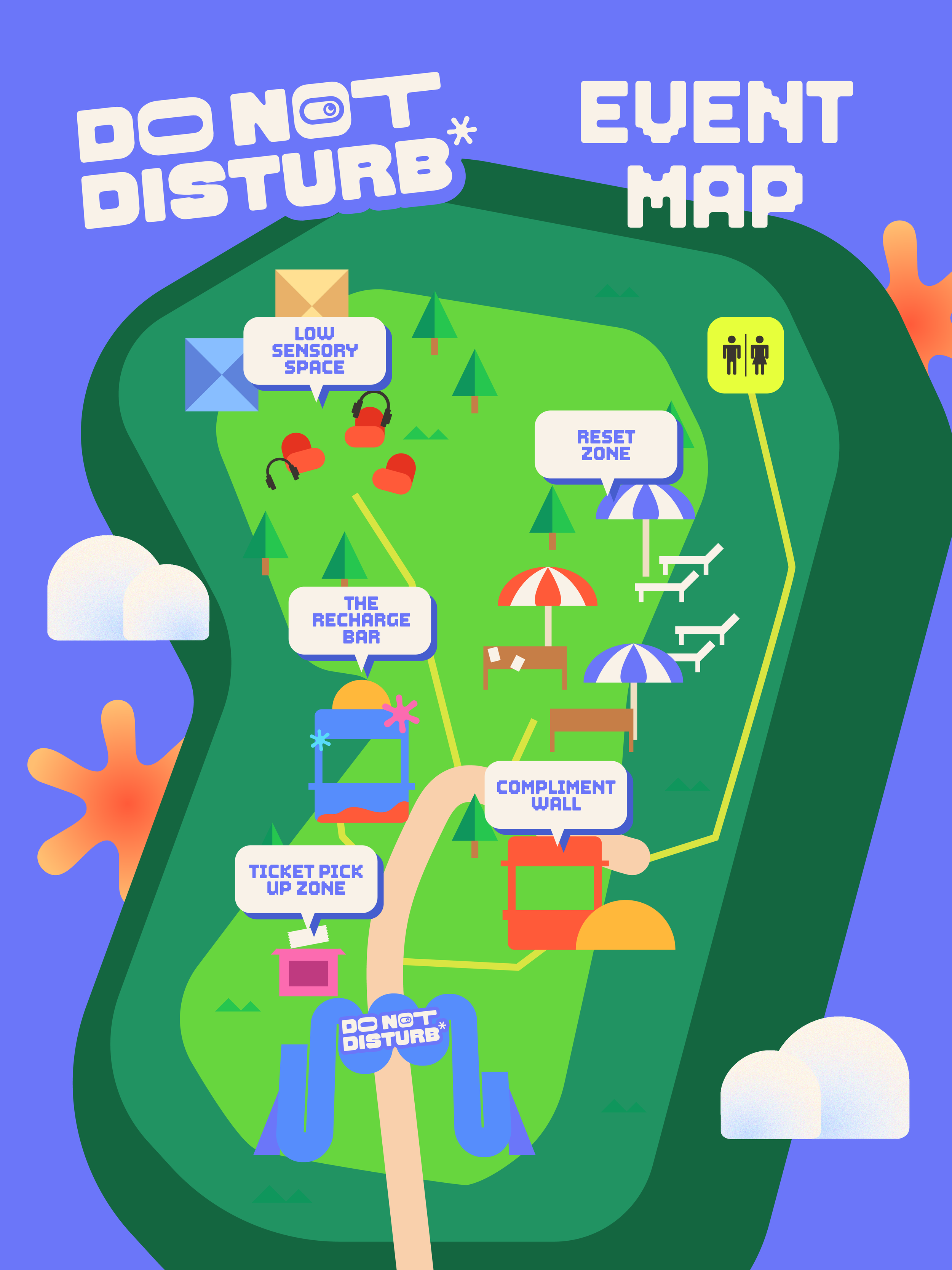
Pick up your ticket, collect your Permission Slip, and wander. There's no set order and no schedule. Visit the Recharge Bar, drop a note at the Compliment Wall, or head straight to the Reset Zone and lie down.
Is the event accessible?
4
Yes - we do our best to ensure everyone gets to experience Do Not Disturb by utilising step-free entry, accessible toilets and seating. Additionally, the Low Sensory Space is a separate, calm area with dim, steady lighting, minimal noise and no photography, with earplugs available at the door.
If you have specific access needs, contact us and we can help plan your visit.
BEHIND THE SCENES - THE STORY
*SOUND ON!
CASE STUDY
Hi, I'm Amelia. I'm a graphic designer and marketer who's most interested in work people can walk into, not just look at. Do Not Disturb started with a question I felt myself and the others around me couldn’t answer: why does resting feel like you’re falling behind?
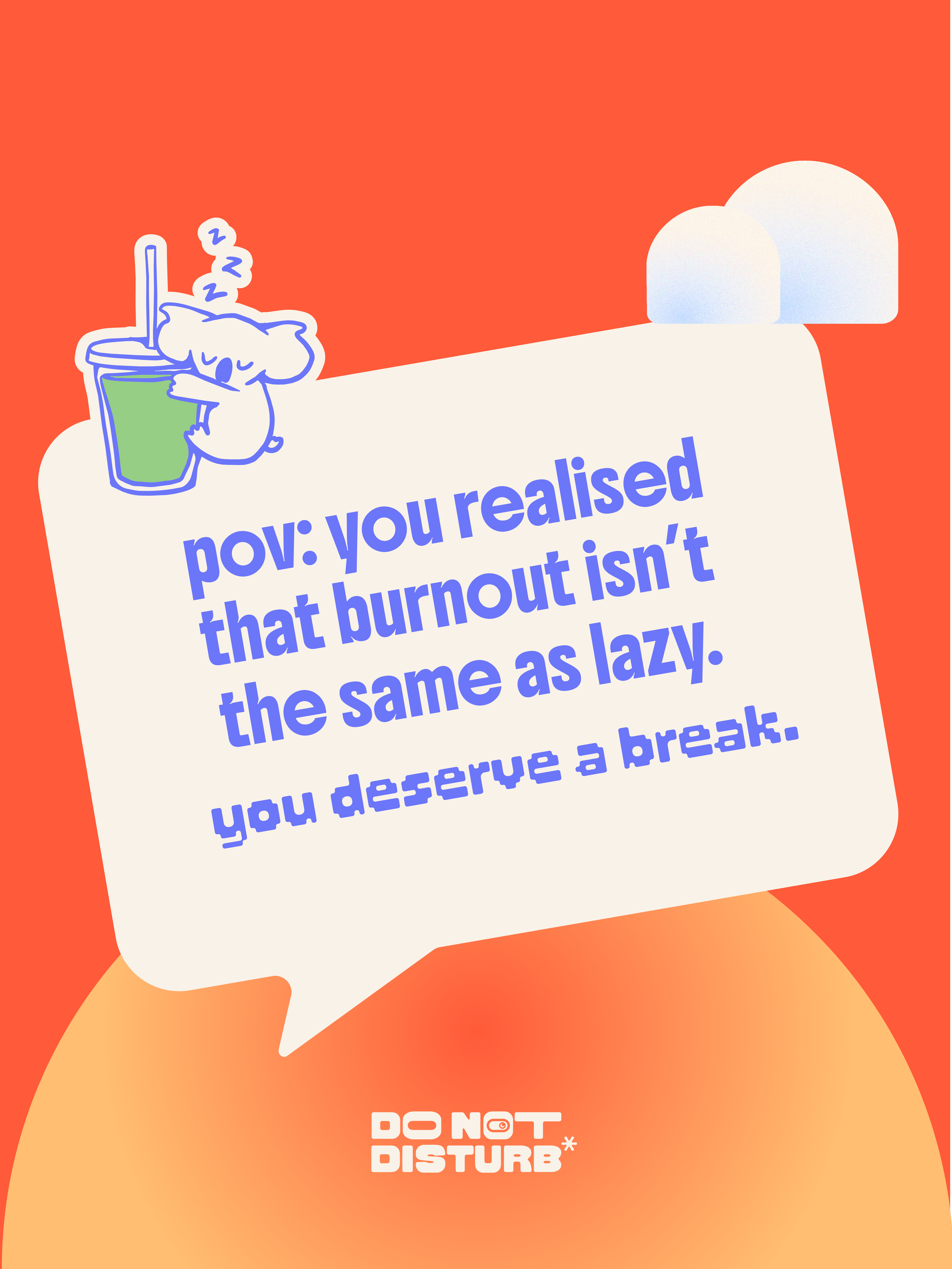
I chose burnout because it’s a subject that resonates personally and see it everywhere around me, and because most of the wellness messaging aimed at young adults gets scrolled past. I wanted to see if a brand experience could do something different, make exhaustion visible, make it shared, and give people a real excuse to stop.
THE BRIEF
The problem: Young adults don't lack information about rest. They lack permission to take it without guilt.
The audience: Burnt-out university students and young adults, especially during assignment and exam periods.
The goal: Raise awareness of shared exhaustion, build a sense of belonging, and offer a genuine moment of rest.
My role: Brand identity, mascot design, collateral and campaign content, all from concept to final assets.
The edit: My first brief aimed to reduce burnout, however, partway through, I changed direction. A pop-up can't cure burnout, and claiming it could would have been dishonest. What it can do is show people they're not alone and give them a pause, so that became the project.
FROM IDEA TO IDENTITY
Research: I started with the audience (young adults) and how they talk about being tired, what wellness campaigns they ignore, and what makes an event worth showing up to.
Visual direction: I built the identity around bold colour blocking and soft calming gradients, chunky and friendly typography, and organic rounded shapes so the brand would feel more like a fun, festival experience rather than a clinical campaign.
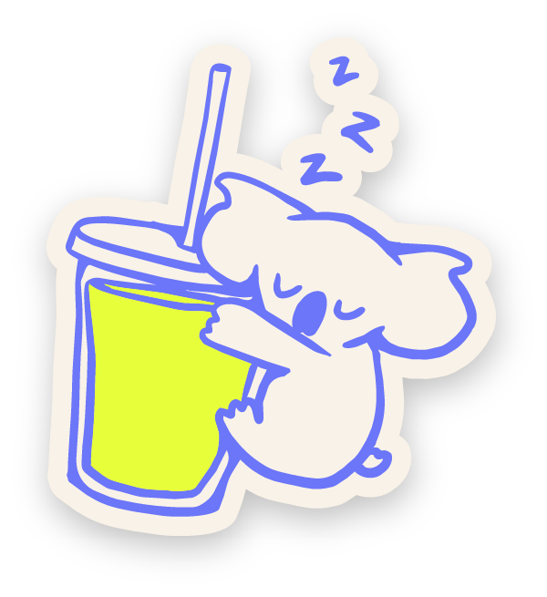
The mascot: “Kip” the koala was developed from an initial blob vector, and then to a shortlist of sleepy animals. I landed on a sleeping koala holding an iced matcha so he’s relatable, a bit funny, and exactly what Do Not Disturb asks people to do.
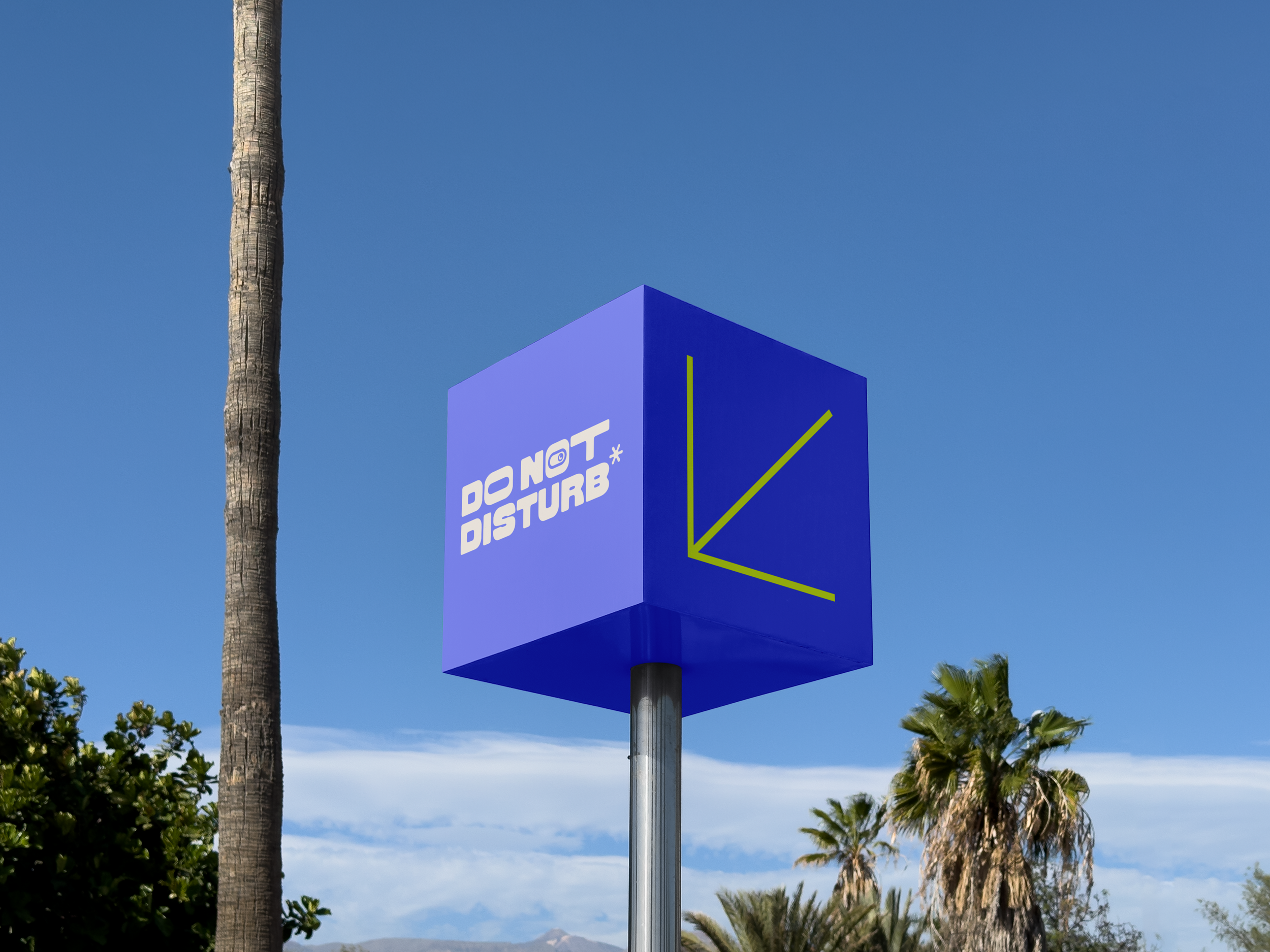
The experience: I designed all of the collectible assets, signage, event map, and social media to work as part of one journey, with a cohesive brand feel that appeals to the younger audience and looks attractive on social media (to promote the event and raise awareness).
INDUSTRY FEEDBACK
I received industry feedback from the CEO of a design studio in Sydney and a senior graphic designer - whilst the feedback was mainly positive, they guided me in how to present my project to my audience. Initially, I did not design the festival entrance and map, however, I was told that the project became hard to understand what it was about from the first glance.
Additionally, Sara Servan guided my final digital presence, advising me on colours and elements that distracted from others and made it look harsh. With this feedback, I was able to change the presentation of the project and make it easy to follow and visually readable.
USER TESTING
I shared the project with 3 university students and 2 working professionals, and asked them if they had experienced burnout and whether this event would interest them. All 5 participants answered the survey saying that they would be interested in attending, with 3 of them experiencing high levels of burnout and 2 experiencing moderate levels of burnout.
I additionally gave 2 of the draft morning motivation door hangers to one of the students and one of the working professionals. They were able to fill out the blank space easily, and said they would take it home with them (instead of throwing it out).